Comprehensive design system
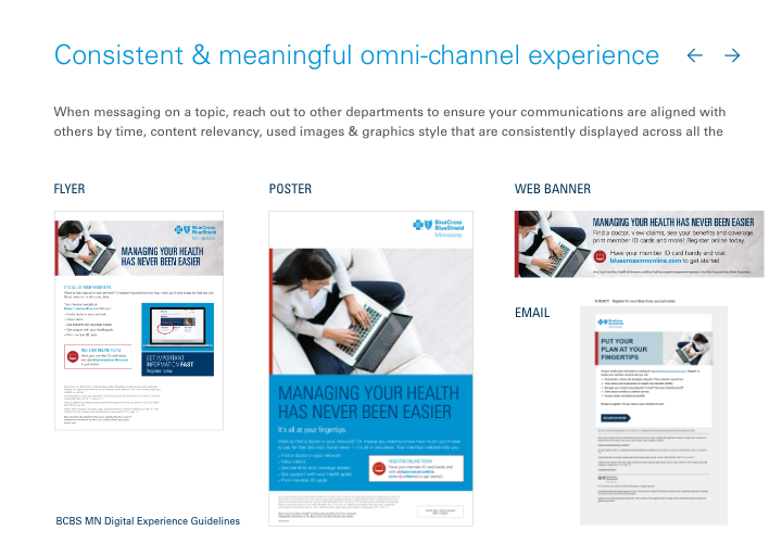
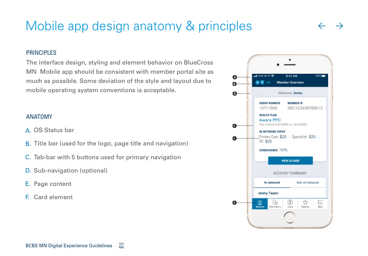
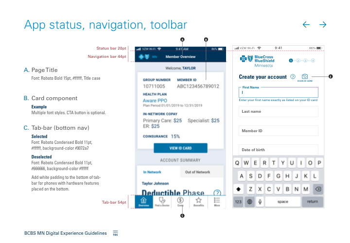
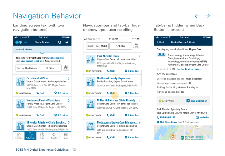
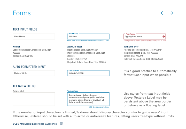
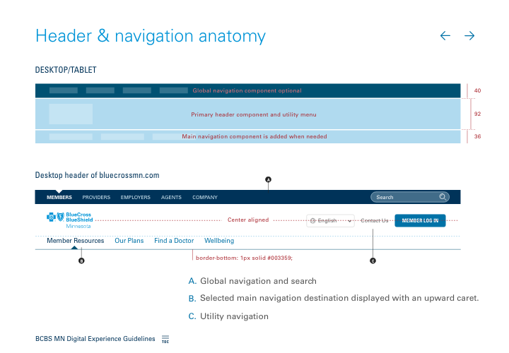
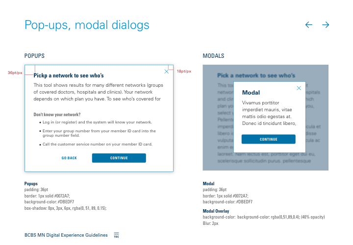
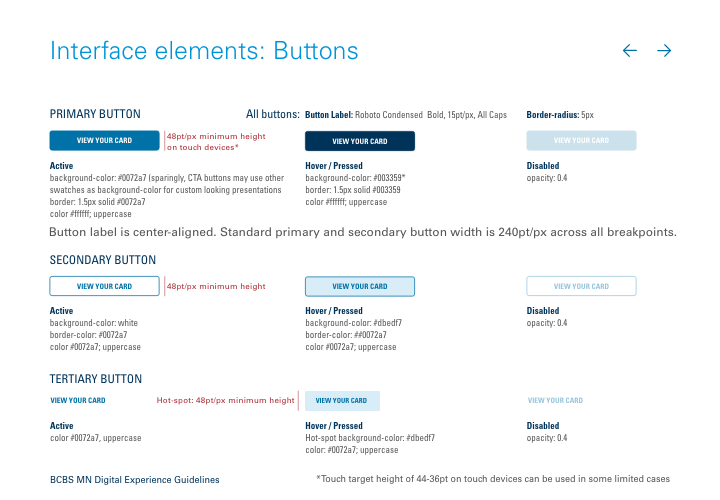
Establishing consistency and quality standards among The Blue Cross’s digital products was a primary goal in creating Digital Experience Guidelines. This Guidelines, as a design system, provided standards for user interface elements, interactivity, and one-stop source for development of omni-channel experiences.
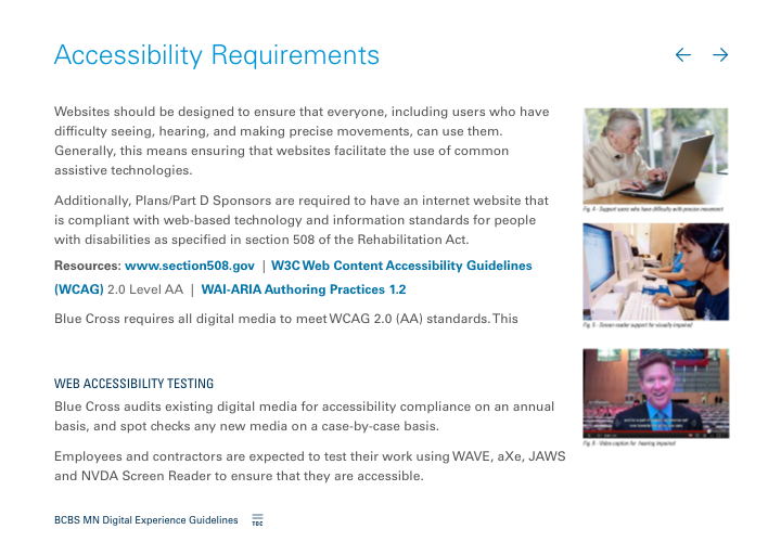
I started this project by outlining major topics then discussing with developers and product managers their needs and content to include. Further engagement and collaboration with Brand, Marketing and CX helped to review and finalize these guidelines with specific standards, like content writing, brand expression, mobile app code and library, usability, accessibility, domain names and PDF governance, and UX best practices. As a result, Blue Cross received the most comprehensive and useful design system, which has been guiding its web and mobile development, and provides standards for digital and omni-channels experiences.
Deliverbals
- Interactive experience guidelines online documentations
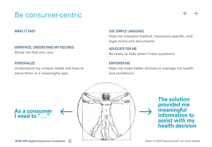
- Human-centered design guidelines
- User interface standards
- Writing and brand standards
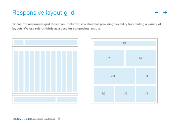
- Responsive web standards
- Mobile app standards
- Email standards
- Usability and Accessibility guidelines
- Domain naming standards
- UX best practices guidelines
In my earlier roles, I contributed to establishing design systems and digital guidelines across multiple projects, including GeoComm’s public safety map product suite, Mayo Clinic’s OpenPayment application, and Coca-Cola’s The Hub. These initiatives involved close collaboration with subject matter experts across Brand, Development, and other teams, all working towards a common goal—standardizing UI components to create seamless, cohesive product experiences. By defining component standards and reusable assets, I helped ensure more efficient development processes, reducing redundancy and enhancing scalability across products.

