
Designing BlueCross mobile app
BlueCrossMN mobile app was reborn in 2019 and went through rapid evolution. Through iterative design and user testing the app became a friendly mobile companion letting users quickly check account balances, estimate costs or find in-network care. Innovations in Find a Doctor search, and Drug Cost estimation resulted in OSAT increase by 36%.
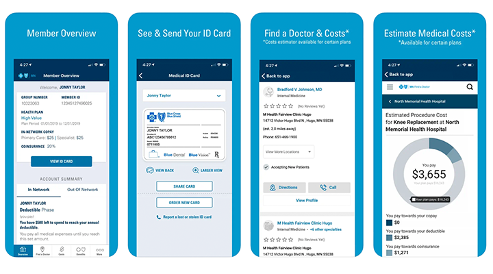
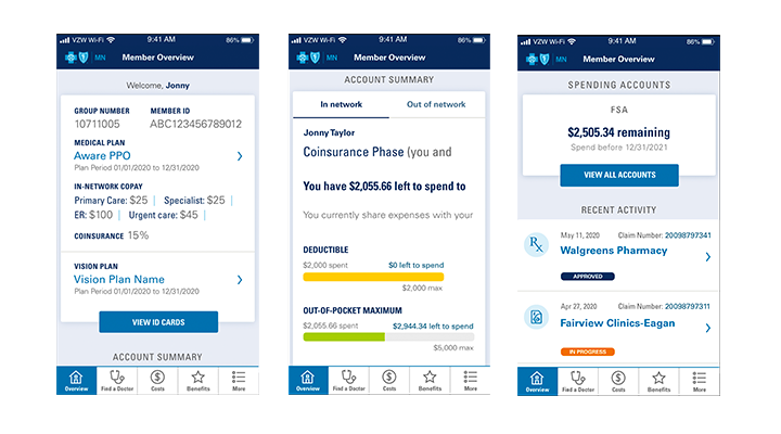
The creative strategy was to provide users with an overview, a dashboard, at landing screen with widgets to view coverage, account balances, claims, and more. We provided multiple ways to navigate improving discoverability, with personalized sub-navigation options at the bottom nav-bar.
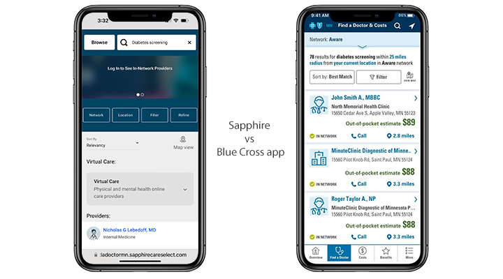
Testing new ideas and designs before implementation proved valuable and instrumental to save costs. According to Ipsos comparative testing, the care cost estimator experience ranked higher than the industry-leading web estimator from Sapphire.
Often, when delivering design to developers screens get annotated with details about interactions and functionality. This works a single source of truth helping engineers to build faster, additional use stories, in places like Jira, detail goals and a high-level design rational. 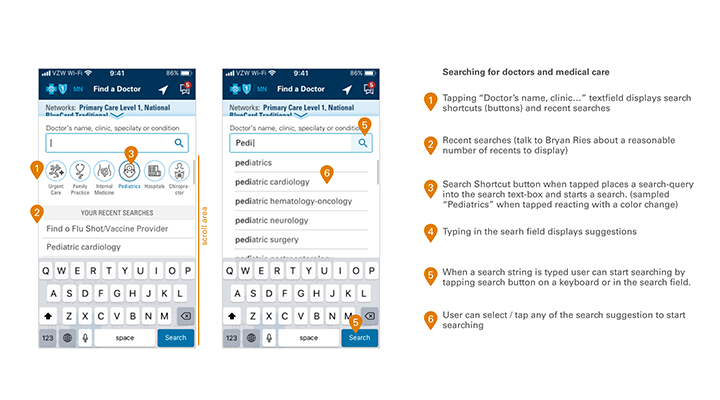
Deliverbals
- Research (heuristic evaluation, accessibility audit, competitive analysis, usability studies)
- Ideations, design iterations and validation (wireframing, high-fidelity prototypes)
- Standards and alignment (WCAG 2.1 AA compliance, design system)
- Design specifications, annotations, use stories for developers
- Guiding implementation and quality control in agile process
- Continues experience research, prioritization and improvements
- Digital artifacts and marketing screens for app stores
- Presentations for Marketing and Sales