Product branding and packaging
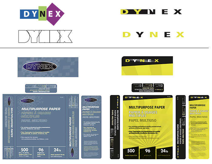
Dynex, Best Buy’s proprietary brand of home office and technology products, needed a refreshed brand identity to better engage customers and build trust in its quality and value. The conceptual design phase was structured as a competitive assignment, open to multiple design teams. Out of several submissions, one of my concepts received the strongest support from stakeholders and focus groups—ultimately winning the brand identity development project for WhiteBoard agency I worked at.
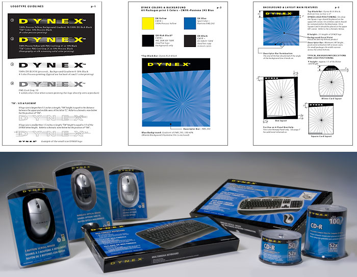
This led to the creation of a comprehensive Dynex brand style guide, establishing packaging standards for hundreds of SKUs. I also designed over 50 finished product packages in collaboration with WhiteBoard team, helping the brand achieve a more cohesive, recognizable, and visually compelling presence across retail shelves.

My Process:
I began by exploring a range of initial directions for the Dynex logotype, packaging layouts, and product mockups, developing multiple design concepts for client review. One of my designs—featuring a bold yellow-and-black layout for multipurpose paper—was selected by Best Buy for focus group testing.

Based on user and stakeholder feedback, I refined the concept by shifting from Best Buy’s signature yellow to a more distinctive blue background, enhancing the typography, and evolving the overall visual identity to better reflect Dynex’s positioning as a trusted, quality brand.
My contributions included
- Creating original brand identity concepts and presentation
- Developing the Dynex visual identity system and packaging standards
- Designing over 50 Dynex tri-lingual packaging, prototyping product packages to test
- Monitoring brand compliance across multiple SKUs
Client/Agency
Best Buy/Whiteboard Product Solutions
