
Redesigning the NCCS Application for Mayo Clinic
I redesigned the National Center of Cancer Study (NCCS) management application for Mayo Clinic, transforming complex, manual-dependent clinical study workflows into a more intuitive, role-based web experience that improved work efficiency by 43%.
Key Improvements:
- Redefined role-based content structure and navigation with clear steps to develop clinical study
- Visual indicators for completed and in-progress steps
- Streamlined medical form entries with good contextual defaults, required-fields hierarchy, quick value selectors
- Reduced clicks and operations to complete key tasks
- Contextual workflow guide with a study preview and share features
- Home dashboard with work progress and to do indicators
- Improved accessibility and digital branding
Challenge
Mayo Clinic initially aimed to modernize the NCCS system by improving the visual presentation of medical entry forms and transitioning the application into a responsive web experience.
However, early evaluation and user conversations revealed that the underlying challenges extended far beyond interface modernization. The application suffered from fragmented navigation, workflow inefficiencies, inconsistent interaction patterns, and heavy reliance on a 100+ page printed manual to complete critical tasks.
This discovery shifted the project scope from a primarily visual refresh into a broader human-centered redesign initiative focused on workflow usability, role-based navigation, and operational efficiency.
Discovery & Strategy
After reviewing the existing application, I identified several core usability and workflow issues:
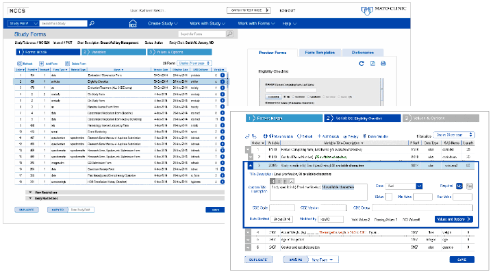
- Complex multi-branched navigation and content organized alphabetically and without clear user workflows
- Accessibility challenges and inconsistent form-entry patterns
- Heavy reliance on a printed user manual—over 100 pages long—to complete workflows
- Poor color contrast with limited active-state visibility user interface
To better understand the operational challenges behind these issues, I expanded the discovery process through contextual inquiry, individual interviews, and collaborative sessions with users and team leaders.
I explored key questions around how clinical studies were initiated, how medical trial data moved through the system, and where friction, confusion, and unmet needs emerged across workflows.
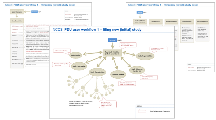
Through this process, I discovered the application served three primary user groups—Study Protocol Developers, Clinicians, and Regulatory Staff—each with distinct goals, navigation behaviors, and workflow requirements. Even experienced users continued relying heavily on printed documentation, reinforcing the need for a more intuitive, workflow-driven experience with contextual help.
I shared the initial findings brief with the project manager and lead engineer, reframing the project around workflow usability and user-centered operational needs rather than visual modernization alone. This led to an expanded UX strategy and planning with additional interviews, collaborative workshops, and iterative validation sessions with representatives from each user group.
Key findings included:
- Each user group required a dedicated workflow-oriented navigation
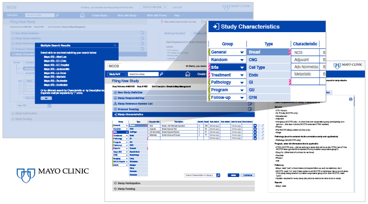
- Form-entry workflows included three types of required-field logic, each needing distinct visual treatment
- Users needed clearer visibility into study development progress and easier ways to preview or share study data
- Existing workflows introduced unnecessary operational friction and cognitive overload
Solution
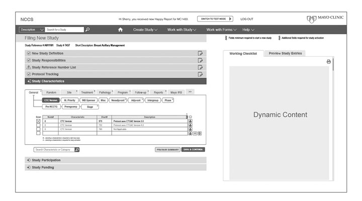
I redesigned the application around role-specific workflows, introducing dedicated navigation paths and restructured information architecture tailored to each user group. A contextual side panel provided workflow guidance, study previews, and sharing capabilities that improved collaboration, visibility, and user support throughout the clinical study process.
In addition, I introduced a personalized dashboard experience that surfaced workflow progress, completed activities, pending tasks, and study status based on each user’s role and responsibilities. To streamline testing workflows, a prominent Test Mode entry point was designed for immediate visibility and efficient study validation.
Outcome
The project evolved from a limited visual modernization effort into a broader transformation of workflow usability, navigation architecture, and user experience strategy.
Previously, users navigated alphabetically through disconnected sections and relied heavily on a 100+ page printed manual to complete workflows. The redesigned experience introduced role-based workflows, guided study progression, contextual support, and improved study visibility and sharing capabilities.
The project followed a full user-centered design process—from evaluation and discovery through iterative prototyping and final implementation specifications. Close collaboration with engineering ensured technical feasibility and a smooth implementation handoff.
The result was a 43% improvement in work efficiency, delivering a more intuitive, workflow-driven experience for clinical teams while significantly reducing operational friction.
Deliverables
- User research synthesis and workflow mapping
- Heuristic evaluation and accessibility audits
- Information architecture and navigation diagrams
- UX ideation, wireframes, and interaction concepts
- High-fidelity responsive screens and interactive prototypes
- UI and interaction specifications for implementation
- Standards and guidelines for reusable UI components