Redesigning NCCS application for Mayo Clinic
The redesign of the National Center of Cancer Study (NCCS) management application for Mayo Clinic significantly enhanced the user experience, resulting in a 43% increase in work efficiency.
Key Improvements:
- Redefined content taxonomy and role-based navigation with clear study development steps
- Visual indicators for completed and in-progress steps
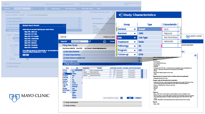
- Streamlined workflows and medical form entry with enhanced required-field indicators
- Reduced clicks and operations to complete key tasks
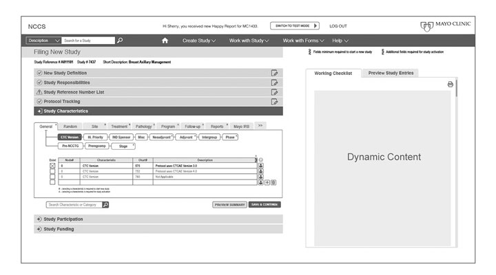
- Contextual workflow guide with a study preview panel
- Improved accessibility and consistent visual branding

Challenge
Mayo Clinic’s engineering team aimed to modernize the NCCS system by transforming it into a responsive web application with improved usability and a more effective visual presentation of data entry forms.
Design Process
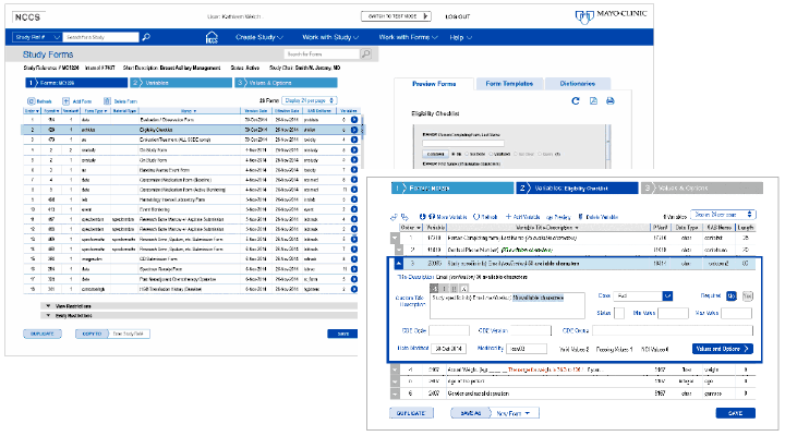
After reviewing the existing application, I identified several core usability issues:
- Complex, multi-branched navigation organized alphabetically with no clear user journey
- Outdated UI with poor color contrast and no indication of active states
- Accessibility challenges and inconsistent form patterns
- An overwhelming reliance on a printed user manual—over 100 pages long—to guide users through workflows

To better understand the users and their pain points, I asked fundamental questions:
How does a clinical study begin? Who initiates the process? How is medical trial data entered and reviewed?
Through this early exploration, I discovered the application serves three primary user groups—Study Protocol Developers, Clinicians, and Regulatory Staff—each with distinct workflows and navigation needs. Despite some users having over 10 years of experience, many still relied heavily on the printed manual to use the application. This insight emphasized the need for a more intuitive, supportive experience.
Discovery & Strategy
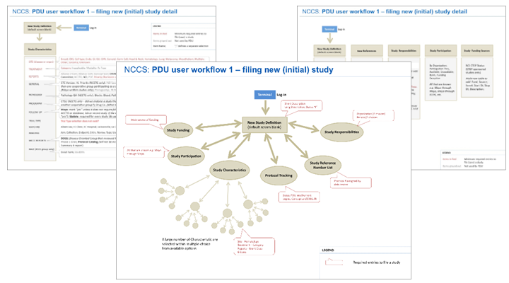
I shared an initial findings brief with the project manager and lead engineer, proposing a user-centered design strategy that included direct user engagement. This led to contextual inquiry sessions, individual interviews, and collaborative discovery workshops with users from each group.
Key findings included:
- Each user group required a dedicated navigation path tailored to its workflow
- Form fields had three types of required entries, each needing distinct visual treatment
- Users wanted a real-time view of study progress and a way to preview or share the full study

Design Execution
I introduced a restructured content taxonomy and role-specific navigation. Vertical content flows were mapped to each group’s process, and I added a contextual side panel showing a dynamic workflow guide and a study content preview, which could be printed or exported as a PDF.
Multiple wireframe iterations and prototypes were validated through feedback sessions with both users and the engineering team.

Outcome
This work followed a full user-centered design process—from initial evaluation and user research to iterative prototyping and delivering a final design with specification. Close collaboration with engineering ensured feasibility and smooth handoff for implementation.
The result: a streamlined, accessible, and highly functional application that significantly improved usability and efficiency across all user groups.
Deliverbals
- User research and analysis, user workflow maps
- Heuristic evaluation, accessibility audits
- Information architecture diagrams
- Ideations, wireframes
- High-fidelity screens and prototypes for viewport sizes
- Specifications for user interface and interactions
- Standards for UI components
